Best Logos for Real Estate: 53 Examples & Design Tips
Looking for the best logos for real estate to inspire your brand identity? You've come to the right place. We've curated and analyzed 53 of the best real estate logos from successful agents and brokerages across the country. From luxury real estate firms like AEC St. Regis to innovative personal brands like the Miami Real Estate Twins, these designs showcase what makes a real estate logo truly exceptional.
Explore our complete gallery of 53 professional real estate logo examples to see how top performers in the industry build memorable brands that convert. Whether you're launching a new real estate business or rebranding an existing one, these award-winning logo designs will guide you toward creating a powerful visual identity.
What Makes Great Real Estate Logos Stand Out?
What separates a good logo from a truly exceptional one? After analyzing hundreds of designs, we've found that outstanding real estate logos share common characteristics—they're memorable, professional, and instantly communicate what your brand stands for.
These award-winning designs serve as powerful visual representations that help establish your identity in a crowded market. Whether you're a luxury agent, a family-focused realtor, or a commercial specialist, your logo needs to capture attention, instill confidence, and remain memorable.
This article showcases the best logos for real estate from our curated collection of 53 professional examples, breaking down the essential elements that contribute to a powerful brand identity in the property market.
Key Takeaways
Symbolism and Imagery
A real estate logo often incorporates symbols related to homes, buildings, keys, or other imagery directly connected to the real estate industry. These symbols help instantly communicate the business's nature to potential clients.
Brand Identity
The Real Estate logo is crucial to the real estate brand's identity. It should align with the brand's values, mission, and target audience. For example, a luxury real estate firm might opt for a more elegant and sophisticated design, while a family-oriented real estate agent might choose a warmer, more welcoming style.
Color Scheme
Color choices in Real Estate logo design can significantly impact the brand is perception. Different colors evoke different emotions and associations. For instance, blue can convey trust and professionalism, green can signify growth and freshness, and black can suggest luxury and sophistication.
Typography
The font choice in a real estate logo is important for readability and brand personality. Fonts can range from modern and sleek to traditional and classic, depending on the brand’s image.
Scalability and Versatility
An excellent real estate logo should be scalable and versatile, meaning it looks good in different sizes and across various mediums, such as business cards, billboards, websites, and social media.
Memorability
The perfect real estate logo should be distinctive and memorable, keeping the real estate brand from competitors. A well-designed logo can leave a lasting impression and aid in brand recall.
Professionalism
A professionally designed real estate logo can convey credibility and trustworthiness, which are vital in the real estate industry where clients make significant financial decisions.
53 Award-Winning Real Estate Logo Examples
We've analyzed hundreds of real estate brands and identified designs that consistently drive results. Our collection of 53 professional examples represents the cream of the crop in brand design—from luxury estates to first-time homebuyer specialists.
Let's explore standout examples from different categories to see what makes the best logos for real estate so effective.
Luxury Real Estate Logos
Among our collection, luxury brands stand out with their sophisticated approach. These represent some of the best logos for real estate in the high-end market:
- AEC St. Regis - Combines classic elegance with modern minimalism
- NB Elite Luxe - Uses gold accents to convey premium service
- Lecussan Group - Features architectural elements that speak to high-end properties
- The Peralta Brothers - Refined typography and elegant design for discerning clients
- Sublime Living - Sophisticated serif fonts that communicate luxury
View all luxury real estate logo designs in our interactive gallery to see detailed breakdowns of what makes each design effective.
Minimalist Logo Designs
Simplicity often wins in real estate branding. These clean, modern designs prove that less is more and represent some of the best logos for real estate agents:
- IM Real Estate - Clean monogram with strategic pink accent for differentiation
- Calli Henley - Typography-focused design that's instantly memorable
- MT Real Estate - Sleek lettermark that works across all platforms
- SP Real Estate - Minimalist approach with maximum impact
Real Estate Team Logos
Team brands require a different approach. These examples from our complete showcase excel at representing multiple agents while maintaining a cohesive identity:
- Miami Real Estate Twins - Creative concept that tells a story
- The Peralta Brothers - Strong family brand identity
- The Carolinas - Regional pride meets professional design
- Winn Team Legendary Homes - Bold statement for team branding
Creative & Innovative Examples
Innovation sets these designs apart. They showcase unique approaches that make memorable impressions:
- Danielle Scarlett Real Estate - Unique color palette and modern styling
- Yohanny Diamante Logo - Personal brand with memorable visual elements
- Sophia Ayala Realtor - Contemporary design with personality
- Jennifer Lopez Realtor - Professional yet distinctive approach
Want to see all 53 examples? Browse the complete gallery with high-resolution images and design insights for each logo.
Essential Design Elements That Matter

What Makes an Effective Logo
Great real estate logos have a personality of their own—they uniquely represent your brand and infuse your company's identity into every design element. An effective logo reflects your values while attracting your target audience.
This is achieved through distinctive design elements: creative use of initials, symbols that evoke real estate themes, and unconventional designs that command attention. Looking at our collection of 53 professional examples, you'll notice successful designs share common traits that make them stand out in a competitive market.
Modern Real Estate Logos
Modern designs incorporate clean lines, minimalist graphics, and innovative typography to create a contemporary aesthetic. When creating your logo, consider incorporating local elements such as nature motifs, iconic landmarks, or community symbols. This approach helps foster a connection with your audience and showcases your local expertise—a vital element for success in real estate. Designs that reflect these principles will help your brand stand out in a competitive market.
Color Psychology in Real Estate Branding

Color palettes play a significant role in expressing brand values and eliciting emotions—it's a language that needs no words. Whether your real estate business is new or well-established, the right colors can help differentiate you from competitors and create a strong brand identity.
When you browse through our gallery of 53 examples, you'll see how strategic color choices make these designs memorable and effective.
Typically, real estate logos lean towards colors like:
- Blue represents trust
- Green represents growth
- Gold represents wealth
- Silver represents sophistication A well-crafted real estate logo or "unique logo" can evoke optimism and energy through bright, bold colors. Incorporating elements like a company’s office building into the bold logo can create a sense of familiarity and local expertise.
Typography and Real Estate Logos

Much like colors, the choice of fonts significantly impacts the design of a real estate logo. The right font can significantly influence the overall visual impression of a perfect logo vs just a good logo. Serif fonts, for instance, convey a sense of tradition and stability, making them ideal for businesses dealing with commercial properties where clients expect a high level of expertise and professionalism. On the other hand, sans-serif fonts suggest modernity, simplicity, and professionalism. These attributes contribute to a clean and sleek logo design, helping your real estate business stand out in the competitive market.
Incorporating Elements in Your Real Estate Logo

Elements in a Real Estate Logo
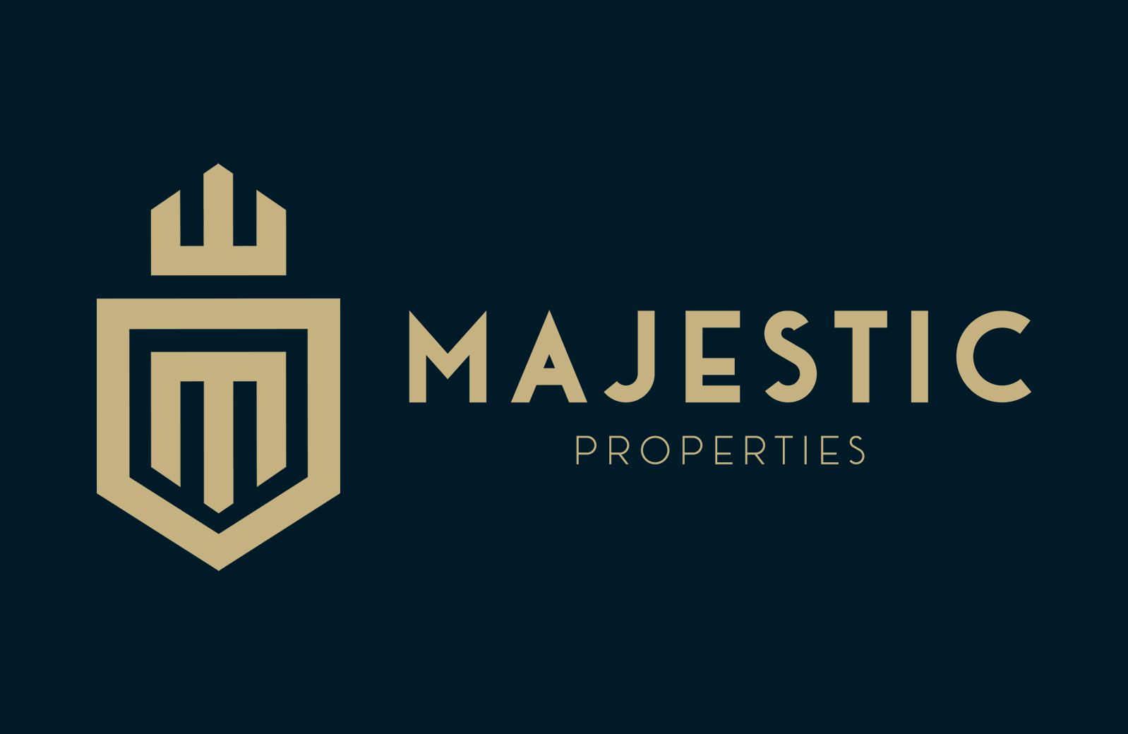
Local elements in a logo can act as a bridge, connecting your business with the community. Including local landmarks, regional symbols, or seasonal events can showcase your local acumen and foster a robust bond with your target audience. It’s essential for established businesses aiming to uphold their market presence, amplify their ties with the community, and contribute to the global community. For instance, the real estate logo of Majestic Properties incorporates a crown with an upside-down "M" and a golden crest, reflecting majesty. This effective use of local elements creates a strong brand identity that resonates with the local community.
Gallery: See All 53 Best Real Estate Logos in Action
Ready to explore the complete collection? Our comprehensive logo gallery features all 53 professionally designed logos with detailed analysis. Effective real estate logos are as diverse as the properties they represent. From modern, minimalistic designs to traditional, classic motifs, compelling logos come in many forms.
What they all have in common are attributes like modernity, memorability, and visual appeal. A bold font, a color symbolizing stability, and design elements that convey authority and confidence all contribute to making a logo more effective.
Why Browse Our Logo Collection?
Our interactive gallery provides:
✅ 53 professionally designed real estate logos - The largest curated collection ✅ High-resolution images - See every detail clearly ✅ Design analysis - Learn what makes each logo effective ✅ Categorized by style - Find inspiration that matches your brand ✅ Free to explore - No registration required
Creative Logo Design
Take, for example, the logos of new and established companies like Property Match Finders, a Real Estate Company that helps you find seasonal homes in Florida. These logos utilize distinctive design styles, such as simple real estate art, creative typography, and clever representations of the company name, to create a lasting impression.

Luxury Real Estate Logos
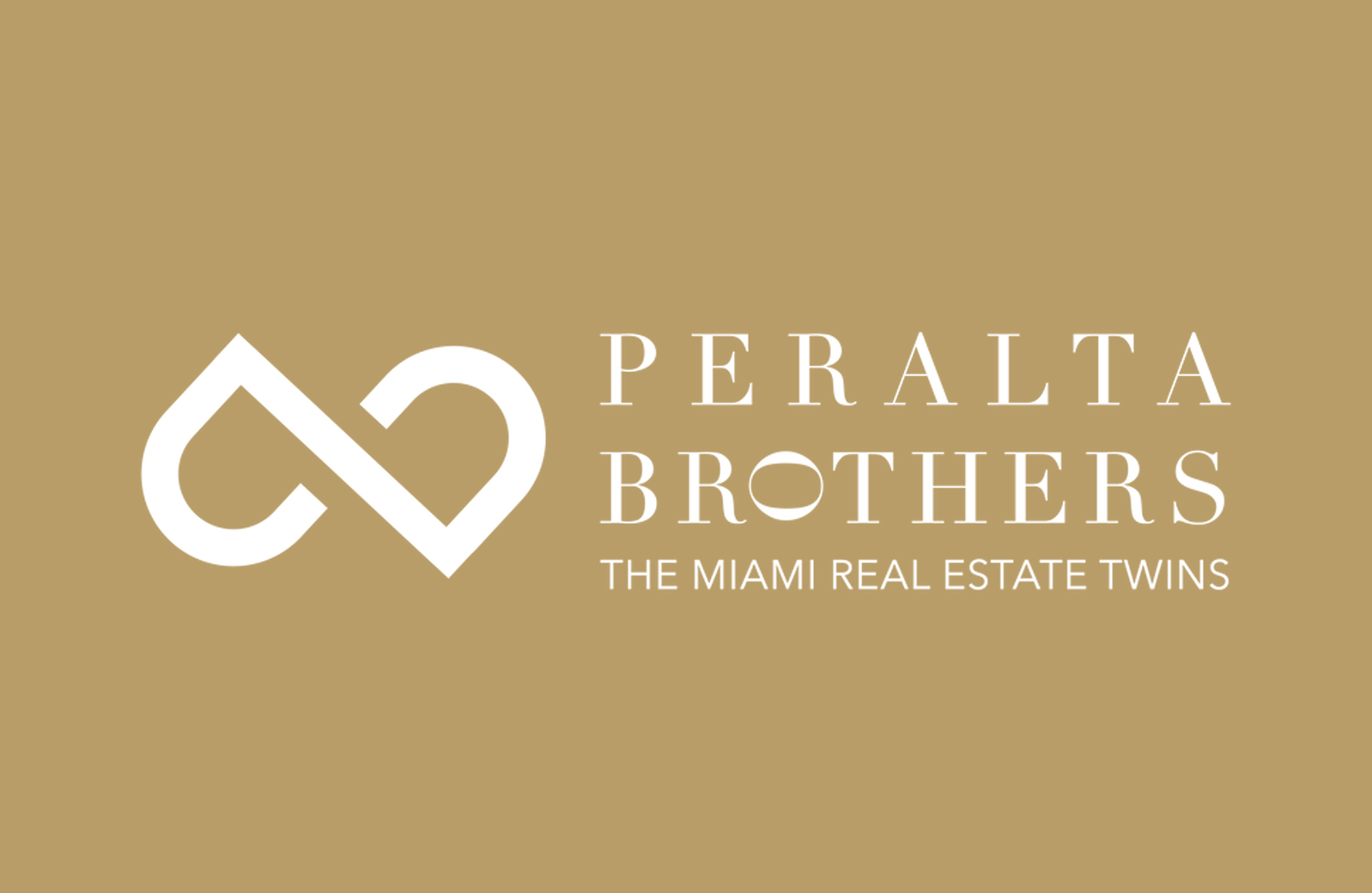
Regarding luxury real estate logos, the design must reflect the high-end nature of the business. The logo should be one-of-a-kind and entirely adaptable to ensure alignment with the brand’s distinctive qualities and principles. Take the logo of The Peralta Brothers, for instance. This logo showcases refined and elegant designs that resonate with discerning clients and symbolize the upscale properties they represent.
Luxury Real Estate Logos with Essence

Like any other logo, a luxury real estate logo must encapsulate the essence of luxury, accurately reflecting the market's upscale nature. It is vital to include components like:
- A thoughtfully selected color palette
- Design style
- Fonts
- Slogan These components should resonate with the luxury market and harmonize with the company’s brand and name, ultimately enhancing the brand value. Before initiating a dialogue with a design team, clients should conduct extensive research and develop an initial idea of their preferred aesthetic for the luxury real estate logo. Once a satisfactory design has been achieved, it is crucial to fully embrace it, as this indicates that the design effectively aligns with your brand’s identity and the message you intend to communicate.
Tips for Creating Your Own Real Estate Logo
Creating your own real estate logo can be an exciting journey. It is a process of exploration and discovery, where you create brand identity visually. One of the key steps in this process is engaging in a collaborative partnership with a reputable designer. Open and transparent communication with the designer helps you better understand your real estate brand and effectively communicate your vision. Once you achieve a logo design that meets your expectations, it’s important to accept it wholeheartedly. Your contentment indicates that the design effectively aligns with your brand’s identity and the message you intend to communicate. So, be bold, be creative, and let your logo tell your brand’s story.
Redesigning Your Existing Real Estate Logo
Occasionally, a logo may require some rejuvenation. This could be due to a shift in brand identity, an overbearing similarity with other industry logos, or a lack of connection with your target audience. When such a time comes, consider a redesign that integrates modern design elements and aligns with current trends. A redesigned logo gives your brand a fresh new look, reenergizes your business, and gives you a competitive edge.
Using Your Real Estate Logo Effectively
When you’ve created a well-crafted logo, the subsequent step is to put it to good use. Consistently using your logo across all marketing materials and platforms helps to create a cohesive brand identity and increase recognition. Your logo should be front and center, whether on real estate marketing tools, social media sites, IDX websites, business cards, yard signs, or social media profiles. This consistent visibility reinforces brand recognition and helps build trust with your audience.
Real Estate Logo Design Trends to Watch
Keeping abreast of current trends is vital in the dynamic realm of design. In 2024, new design trends emphasize innovative elements and uniqueness in real estate logos. By being attentive to these trends, you can integrate distinctive and creative elements into your logo, enhancing your visibility in the competitive real estate market. An example of a modern trend is the rooftop element in the Mid-Atlantic logo, where a conventional symbol is reimagined stylishly and innovatively. This results in a distinctive and appealing aesthetic, serving as a reminder of the power of creativity and innovation in logo design.
How to Create Your Own Award-Winning Logo
After exploring 53 award-winning logo designs, you now have a comprehensive understanding of what makes an exceptional design. Creating an outstanding logo is a journey that requires thoughtful consideration of various elements. Every detail matters, from color and typography to incorporating local elements and staying on top of design trends.
Exceptional real estate logos are not just visual representations—they're powerful tools that help you connect with your audience, differentiate your business in a competitive market, and ultimately drive success.
Key Takeaways from Award-Winning Designs
Looking at our collection of 53 professional examples, exceptional real estate logos share these qualities:
- Simplicity - Clean, uncluttered designs that are easily recognizable
- Memorability - Distinctive elements that stick in clients' minds
- Relevance - Visual connection to real estate and your target market
- Versatility - Works across all platforms and sizes
- Timelessness - Avoids trendy elements that quickly date
Remember, your logo is not just an emblem but your story and identity. So make it unique, make it memorable, and most importantly, make it truly yours.
Ready to get inspired? Explore all 53 logos in our gallery →
Frequently Asked Questions
How do I choose the best logo for my real estate brand?
When selecting a logo design, aim for simplicity with one or two colors and a clean font, uniqueness to avoid generic images, and steer clear of passing trends. Study our gallery of 53 professional logos to see successful examples. Consider fonts, colors, required sizes, and current design trends that will keep your brand relevant.
Should realtors have their own logo and branding?
Yes, realtors should have their own logo and branding to create a memorable personal brand and make a solid first impression on potential clients.
What colors work best for real estate logos?
Blue is the most widely used color in the industry and preferred by most professionals for its association with trust and professionalism. However, successful real estate logos often use strategic color combinations that align with their brand identity. Browse our collection of 53 professional examples to see how successful agents use color psychology effectively.
What makes a real estate logo effective?
An effective logo is modern, memorable, visually appealing, and accurately represents the brand's identity through distinctive design elements, color, typography, and local features. Study our curated collection of 53 examples to see these principles in action across different styles and markets.
How can I incorporate local elements in my logo?
You can effectively represent your area of operation and demonstrate your local expertise by incorporating local landmarks or regional symbols into your logo. This will help your logo connect with your target audience.